Built with BEMSkel
React Examples Coming Soon
Examples using BEMSkel with React will be added soon.
Written using BEM (Block, Element, Modifier) convention to make your front-end code easier to read and understand.
Uses 7-1 Architecture pattern for maintainable and scalable SASS.
Two ways of creating grids - CSS Grid and Flexbox.
Only includes the most important features to minimize code bloat.
Includes a Gulp build system to automate building of SASS files
Designed to be scalable and easy to customize. Use it as a standalone library or use it a starting point to build your next application.
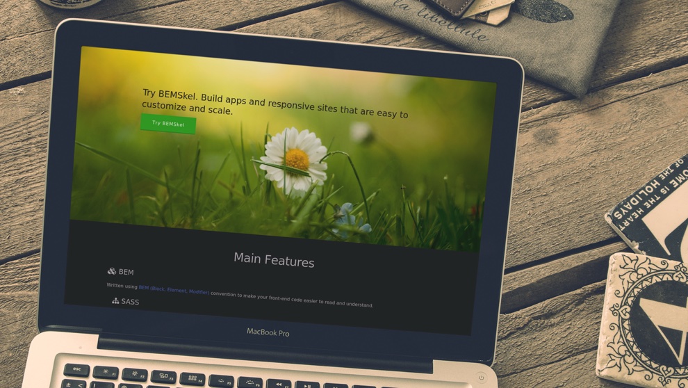
BEMSkel, or short for BEM Skeleton, is a lightweight CSS framework using BEM and SASS. It's designed to provide a solid foundation for building a component-based web applications and user interfaces. It is written using the BEM (Block, Element, Modifier) naming convention to provide a consistent and strict naming convention which allows you to divide your user interface into independent blocks and allow reuse of existing code.
BEMSkel was initially based on Skeleton boilerplate but was rewritten using BEM and added with useful features for building component-based user interfaces. It provides styles for the most commonly used elements such as text, buttons, tables, and forms. It also includes two ways of creating grid systems -- grid and flexbox. As a simple rule, use grid if you need to support older browsers or flexbox if you only want to support modern browsers.
If you like BEMSkel, feel free to share it, tweet it, or start using it. <3
TweetThe grid is a 12-column fluid grid with a maximum width of 1000px, that shrinks with the browser device at smaller sizes. The maximum width can be changed with one line of CSS in the _variables.scss file and all columns will resize accordingly. The syntax is simple and it makes coding responsive much easier. Use the grid layout if you need support for older browsers such as IE9 and below
              col--2
              col--10


              col--3
              col--9


              1/3
              2/3


              1/2
              1/2
Use flexbox grid if you only want to support modern browsers. In this kind of layout, the width of the columns are implicit, so columns will adjust automatically to be equal width to their adjacent columns.
              Auto
              Auto
              Auto
              Auto


              flex-grow: 2
              flex-grow: 4


              fixed-width: 200px
              flex-grow: 4


              flex-grow: large
              flex-grow: default
Type is all set with the rems, so font-sizes and spacial relationships can be responsively sized based on a single <html> font-size property. Out of the box, BEMSkel never changes the <html> font-size, but it's there in case you need it for your project. All measurements are still base 10 though so, an <h1> with 5.0remfont-size just means 50px.
The typography base is Roboto served by Google, set at 1.6rem (16px) over a 2.4rem line height (24px). Other type basics like anchors, strong, emphasis, and underline are all obviously included.
Headings create a family of distinct sizes each with specific letter-spacing, line-height, and margins.
<h1> 50rem<h2> 42rem<h3> 36rem<h4> 30rem<h5> 24rem<h6> 15rem
        Heading
        Heading
        Heading
        Heading
        Heading
        Heading


        The base type is 16px over 2.4 line height (24px)


        Bolded
        Italicized
        Colored
        Underlined
Different button styles are included in BEMSKEL -- classic, outline, raised, and large. Classic button styles are patterned after Bootstrap, which has 5 different color styles -- primary, secondary, info, warning, and danger. Button styles are also applied to a number of appropriate form elements but can also be applied to anchors with a .btn class.
BEMSkel does not include an icon font, but works nicely with popular ones such as FontAwesome. You can use the <i> element to attach icons inside buttons.
Basic form styles are included to help building forms easier.
- Unordered lists have basic styles
-
They use the circle list style
- Nested lists styled to feel right
- Can nest either type of list into the other
- Just more list items
- Ordered lists also have basic styles
-
They use the decimal list style
- Ordered and unordered can be nested
- Can nest either type of list into the other
- Last list item just for the fun
Code styling is kept basic – just wrap anything in a <code> and it will appear like this. For blocks of code, wrap a <code> with a <pre>.
          .some-class {
          background-color: red;
        }
        .some-class {
          background-color: red;
        }
Be sure to use properly formed table markup with <thead> and <tbody> when building a table.
| # | First Name | Last Name |
|---|---|---|
| 11 | Lemmy | Kilmister |
| 10 | Jeff | Hanneman |
| 12 | Jimi | Hendrix |
| # | First Name | Last Name |
|---|---|---|
| 11 | Lemmy | Kilmister |
| 10 | Jeff | Hanneman |
| 12 | Jimi | Hendrix |
| # | First Name | Last Name |
|---|---|---|
| 11 | Lemmy | Kilmister |
| 10 | Jeff | Hanneman |
| 12 | Jimi | Hendrix |
| # | First Name | Last Name |
|---|---|---|
| 11 | Lemmy | Kilmister |
| 10 | Jeff | Hanneman |
| 12 | Jimi | Hendrix |
| # | First Name | Last Name |
|---|---|---|
| 11 | Lemmy | Kilmister |
| 10 | Jeff | Hanneman |
| 12 | Jimi | Hendrix |
| # | First Name | Last Name | Band |
|---|---|---|---|
| 11 | Lemmy | Kilmister | Motorhead |
| 10 | Jeff | Hanneman | Slayer |
| 12 | Jim | Morrison | The Doors |
The pagination component provides default styling for pagination that contains long content and requires splitting content into shorter, easier to understand blocks.
BEMSkel uses media queries to serve its scalable grid, but also has a list of queries for convenience of styling across devices. The queries are mobile-first, meaning they target min-width. Mobile-first queries are how BEMSkel's grid is built and is the preferable method of organizing CSS. It means all styles outside of a media query apply to all devices, then larger devices are targeted for enhancement. This prevents small devices from having to parse tons of unused CSS. The sizes for the queries are:
        /* Mobile first queries */

        /* Larger than mobile */
        @media (min-width: 400px) {}

        /* Larger than phablet */
        @media (min-width: 550px) {}

        /* Larger than tablet */
        @media (min-width: 750px) {}

        /* Larger than desktop */
        @media (min-width: 1000px) {}

        /* Larger than Desktop HD */
        @media (min-width: 1200px) {}
BEMSkel has a number of small utility classes that act as easy-to-use helpers. Sometimes it's better to use a utility class than create a whole new class just to float an element.
        /* Utility Classes */

        /* Make element full width */
        .u-full-width {
          width: 100%;
          box-sizing: border-box;
        }

        /* Make sure elements don't run outside containers (great for images in columns) */
        .u-max-full-width {
          max-width: 100%;
          box-sizing: border-box;
        }

        /* Float either direction */
        .u-pull--right {
          float: right;
        }
        .u-pull--left {
          float: left;
        }

        /* Clear a float */
        .u-clearfix {
          content: "";
          display: table;
          clear: both;
        }
Examples using BEMSkel with React will be added soon.